Design an Invite Program for two hartz
Invite Program
Two Hartz
My Role
User Experience, User Interface
User Research, Usability Testing
Timeline
8 weeks
Solo Project
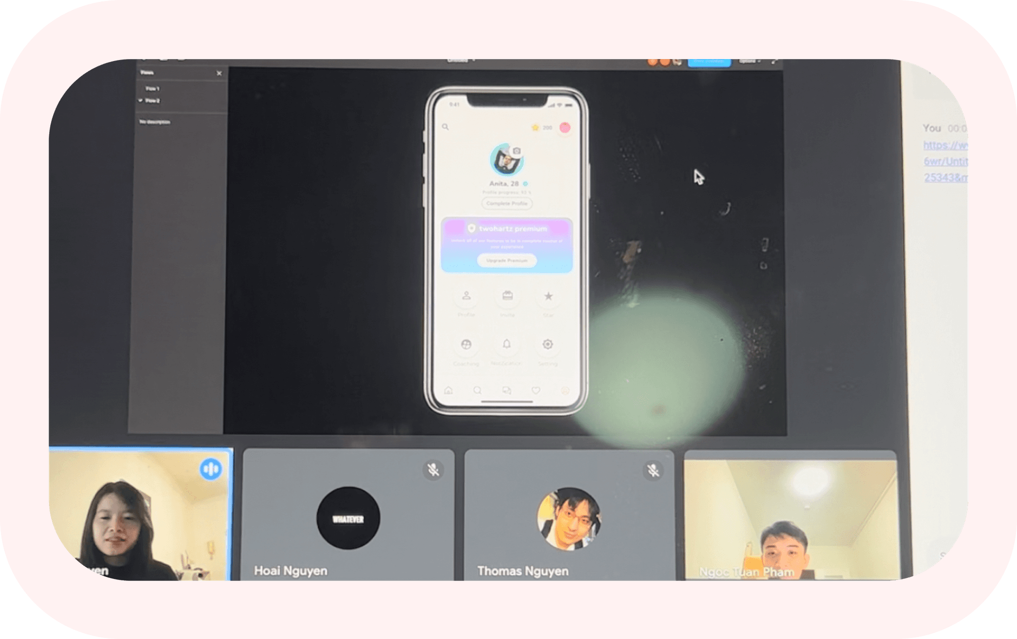
Feedback from Head of Product Sasha Nguyen
Tools
Figma, Google Docs, Zoom
About Two Hartz
Two Hartz is a dating app based in the USA. Two Hartz is a mobile application that is not only focused on dating but it is also focused on improving the love life of individuals, providing emotional support. In an effort to acquire and retain users and enhance their marketing initiatives, Two Hartz opted to introduce a referral program.
Problem Statement
The Challenge - many FIRST TIME endeavors
After studying UX Design foundations for a few months, I had the opportunity to begin with small tasks. Just as a baby takes its first steps, my head of product challenged me by entrusting me with the responsibility of developing a new end-to-end feature, a UX/UI task called 'Invite Program.
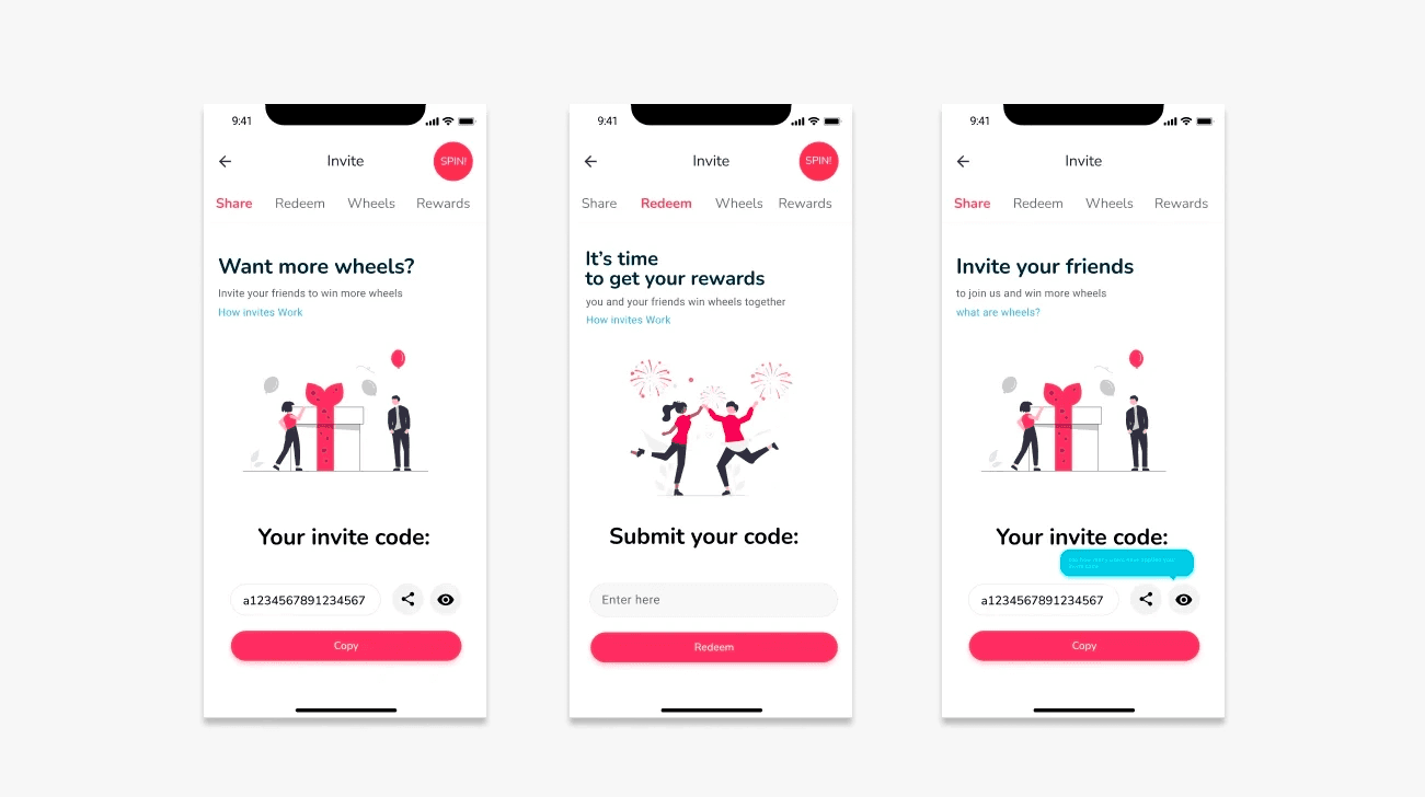
The initial solution was approached instinctvely, without any research
After receiving feedback from the team meeting about a week later, I had the opportunity to conduct usability testing with a UI Designer and the Head of Product on the team. Below are some not-so-positive feedback that I received.
Main screen ambiguity
Users felt everything was unclear on the main screen, unsure about the next steps in navigation.
Feature misunderstanding
Users don't understand some icons that made them click to discover
Unclear Context
Misinterpretation of "Wheels" (game) in invitation program
Approach
01
Define
02
Research
03
Design
04
Evaluate
Research
In the research phase,
I decided to conduct a small user interview with 6 people to have a better understanding of user need when it comes to Invite/ Referral Program. The questions I ask them during the interviews are:
Have you ever used a referral program?
Tell me about the last time you invited your friends?
What motivated you to invite your friends?
Do you have any concerns when inviting your friends or sharing code with them. Below are my findings:
Two-way sided
A quality referral program benefits both the person making the referral and the one being referred; it's always a two-way sided.
Clear defined objective
A well-designed referral program should have a clearly defined objective.
User-friendly Program
A quality referral program is user-freindly and comprehensible for all types of users.
User Motivation
A good referral program offers immediate incentives to maintain user motivation.
Who uses this program?
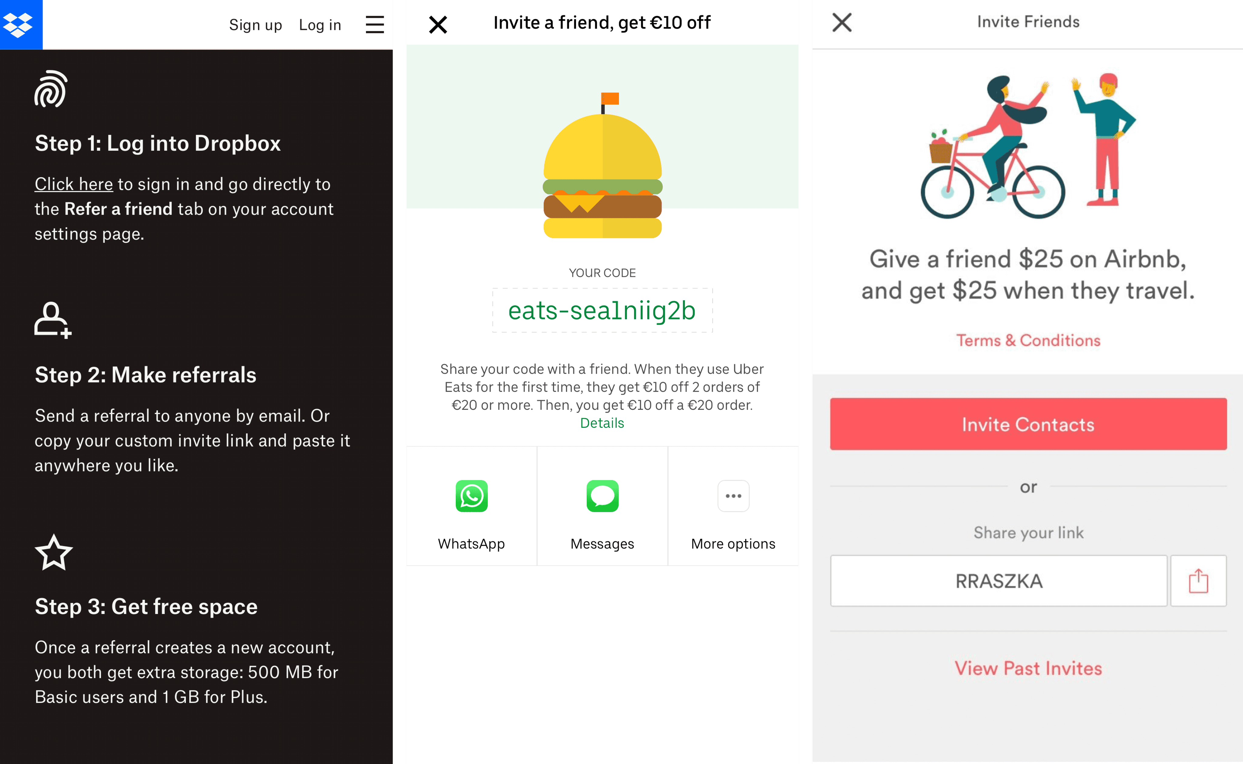
Competitor Analysis
My finding 1: All the referral programs provide clear instructions on what users should do next.
My finding 2: User-friendliness is a common feature among all the referral processes, with intuitive interfaces making them easy to navigate
My finding 3: Users can access all necessary information conveniently on a single screen, minimizing the need for extensive navigation.
Ideation - Exploration
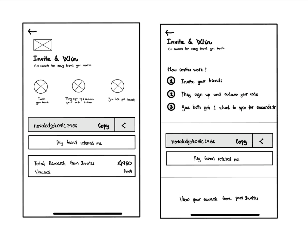
After conducting research and considering the features our company aims to deliver, I have identified two ways for displaying "Total Rewards from Invites as well as ''Instruction'' for the feature.
A/B Testing: After my 2 design versions were approved, I was suggested to conduct A/B testing to gain further insights into user preferences and identify the most suitable screen for the flow. I was doing the test with 17 users and got unexpectedly insightful feedback from them and decided on the final version (left)
Key Insight from the left Version: Save time and effort, Motivation for next steps, Ability to see the progress while collecting points
Key Insight from the left Version: Clean, Easier focus on the task, Better Share and Collect Code.
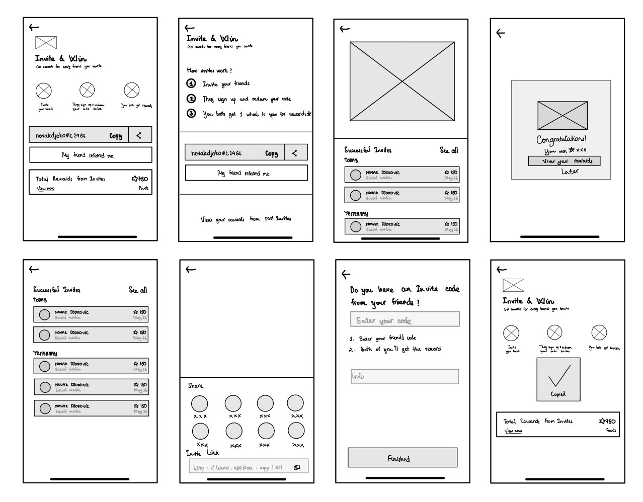
When the sketch idea for the main screen was accepted, I developed the rest of the flow
The wireframe helps me explore different versions, saving time after meetings with the head of products and the team. This way, we can steer the product development in the right direction.
Boosting brand visibility by improving visual elements
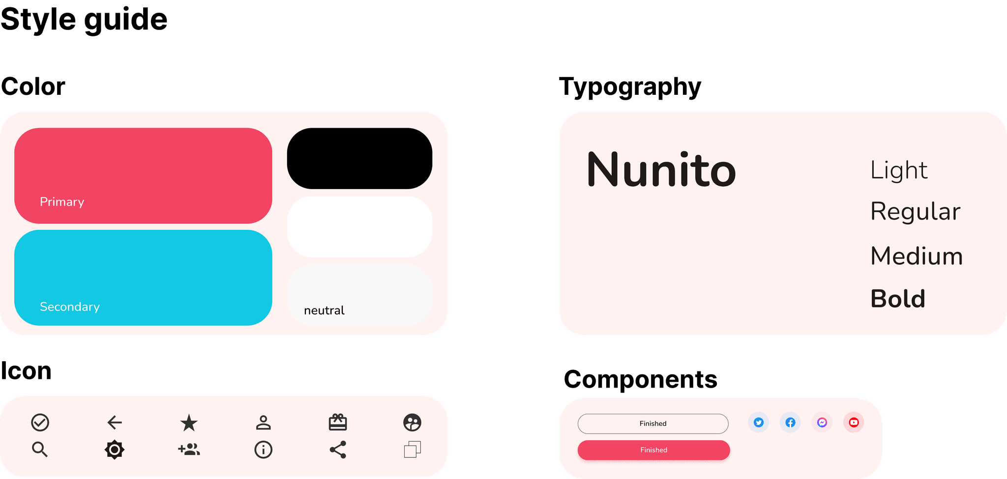
The design must align with the brand’s tone of voice and color range without exceeding them.
How the UI was implemented on my screens
Golden Rule: I apply the 60-30-10 rule to UI design, where 60% is neutral color, 30% is the secondary color, and 10% is the brand color. This rule helps me create better designs and maintain focus on the key elements.
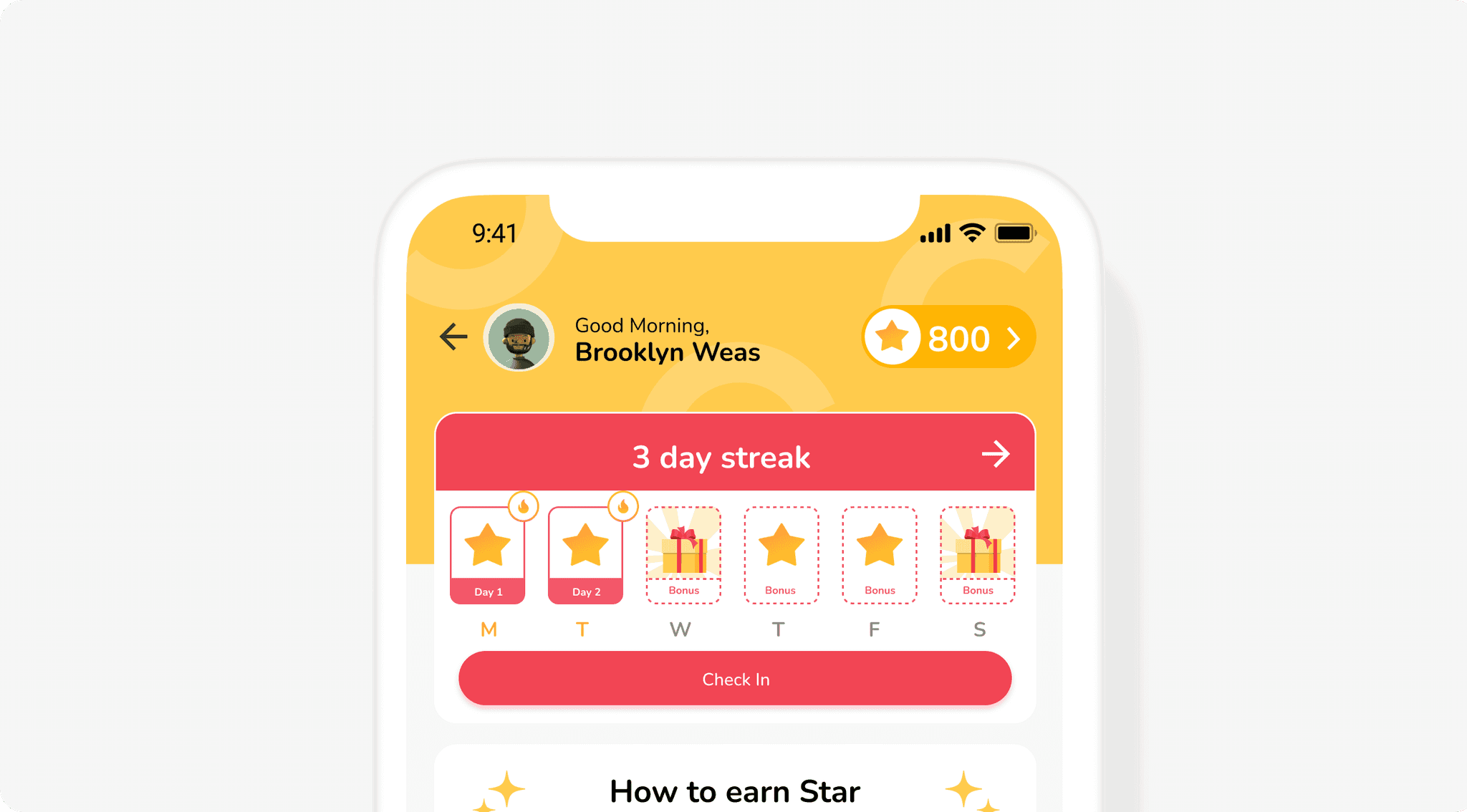
Visual Language: Using dashed lines to emphasize the concept of an unclickable button that can be copied through a press, and incorporating star and gift icons to encourage user engagement within the flow for earning more points.
UX/UI Principles: Closely adhering to the Zeigarnik Effect for instructions and implementing the Common Region principle for boundary definition, the design was made to be more user-centric.
Design Solution
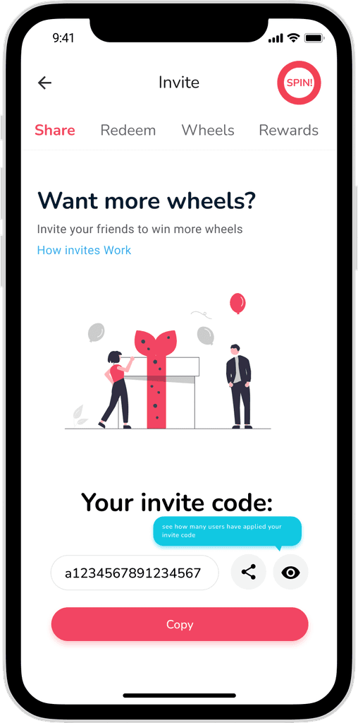
Redesign the main screen
Before
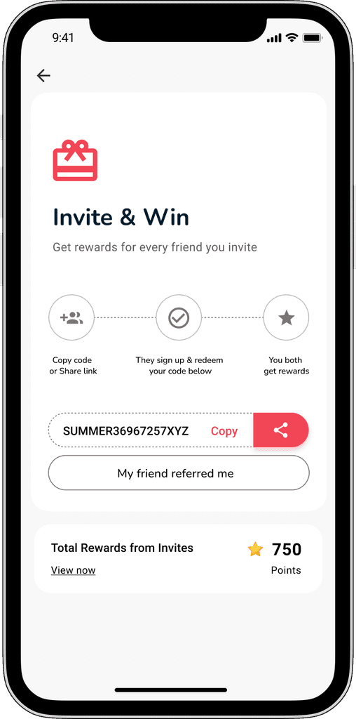
After
Improvements:
‘’Gift’’ motivates users to earn more points and also serves as confirmation of the correct instructions for users when entering the invite flow.
Boundary helps categorize information into a single group
The details and benefits of referral are displayed right upfront
Points were displayed to encourage users to complete the tasks
Simple code and copy option for easing the process for word of mouth and quickshare
Offer instructions to users, new and experienced alike, to help them navigate effectively and encourage them to earn more points
Give and Take
Improvements:
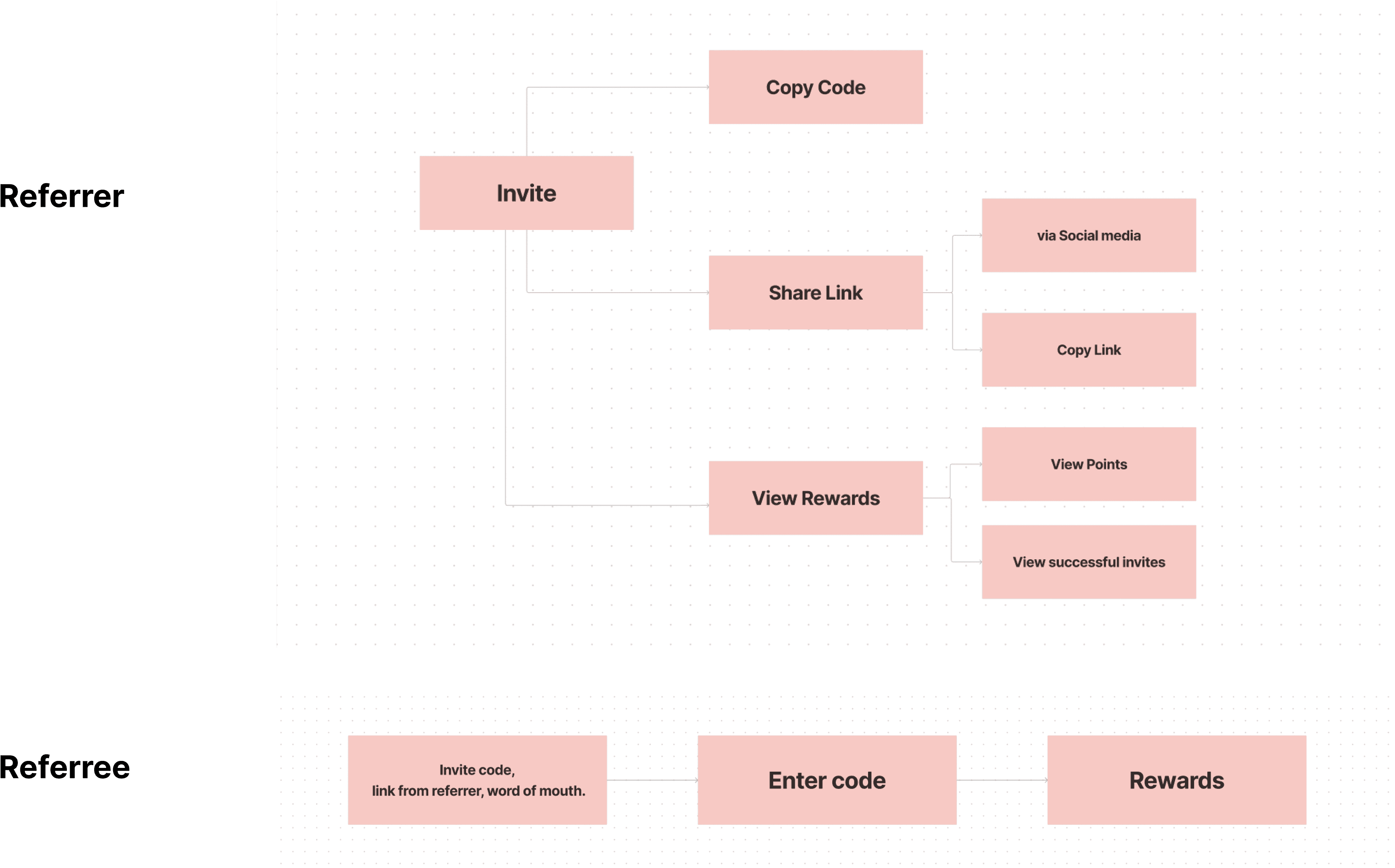
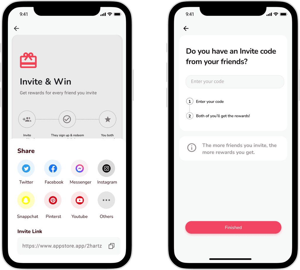
Through sharing, users can share or copy links, copy code snippets. Additionally, if users have a code from someone else's share, they can also input it here.
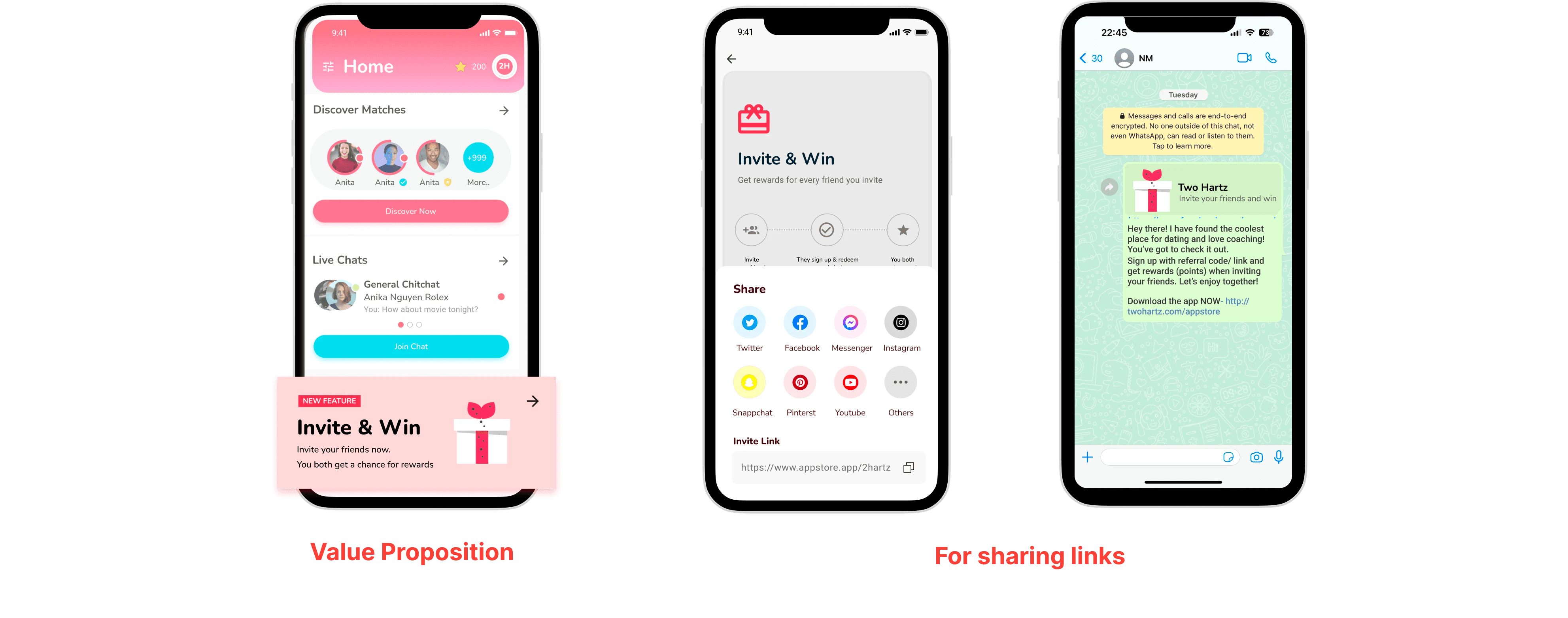
Value Proposition: By adding a banner on the home screen as well as designing eye-catching image that includes information about the invite process, users will feel more motivated to invite their friends to the app. This not only benefits them but also helps the business achieve its goals.
Social sharing and Virality: Users can easily share the link within the invite program on various social media platforms.
Gamification: Our app implements gamification elements (rewards - star) to make the user experience more engaging and enjoyable.
Prototype
Usability Testing
To evaluate this prototype, I conducted a remote task-based usability testing with 6 participants spanning across head of product, UI Designer, students and manager. Here are my findings:
Key Takeawys
Keeping the invite process simple and easy to understand, reducing friction for users improves the user adoption.
Referral programs incorporate behavioural psychology.
Continuously testing and iterating on the program based on user feedback and performance data help me increase effectiveness
Check out another project
Gamification
Design Gamification for Two Hartz
